Discover new tea and coffee products
Sip is a webside that sell high quality coffee and tea products. Discover unique products that fit your particular taste.
Duration
12 weeks
Role
UX designer
Type
School Project
Media
Web and branding
Introduction
About the project
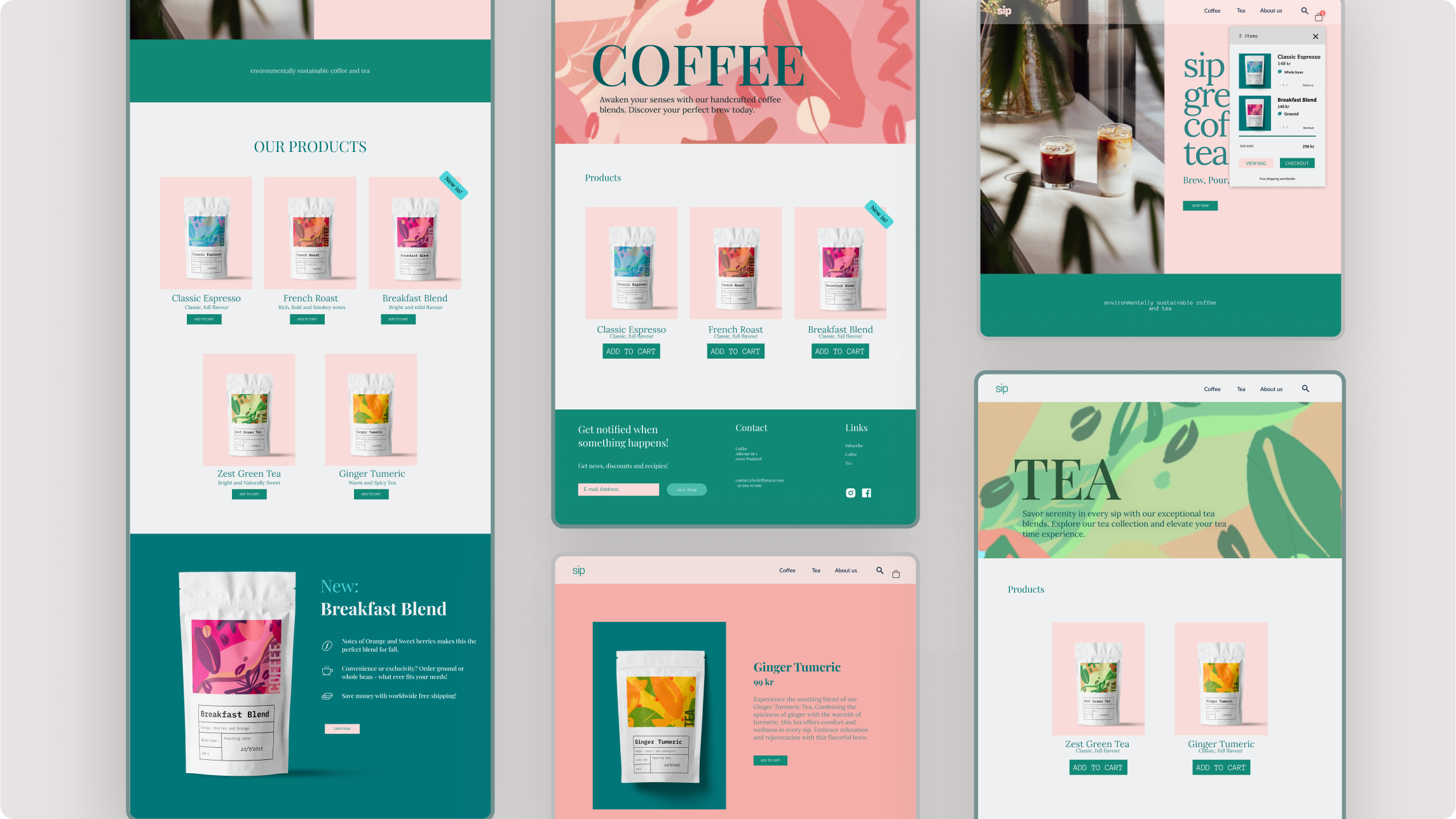
The concept for Sip was created as my project in the subject «GUI». I wanted to create a fictional brand that sold high quality coffee and tea products that were presented in a way that appealed to a younger audience. At the same time, the site should be sustainable, welcoming, and relaxed. This project included touch points like making the content, branding and website for Sip.
Research
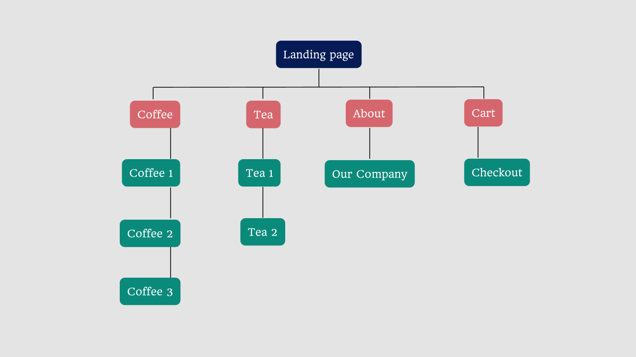
Which pages should the site consist of?
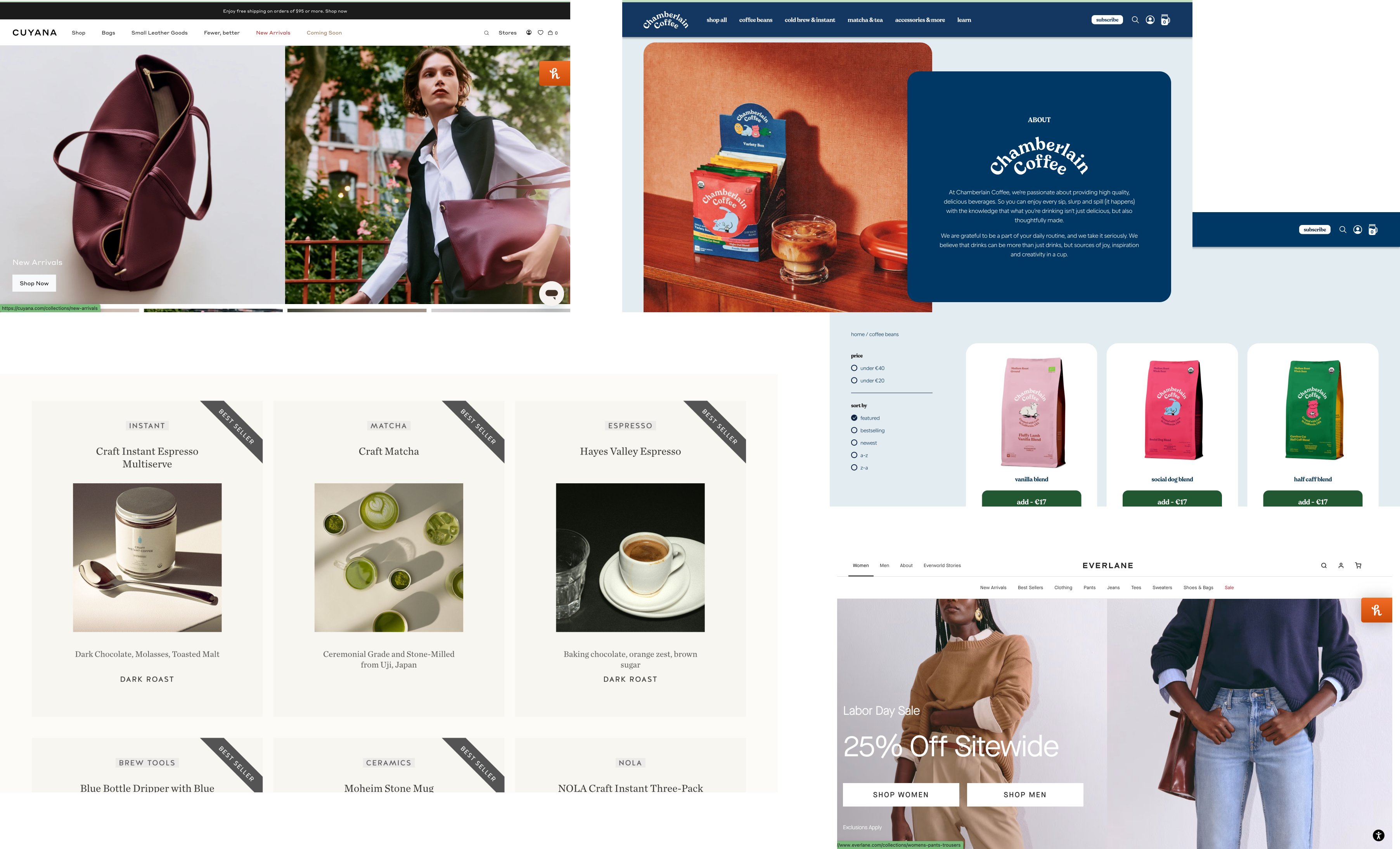
I started the process by researching how other online shops are organiszed. From there I created a sitemap to keep track of how the pages would link together and what content was needed.
Wireframes
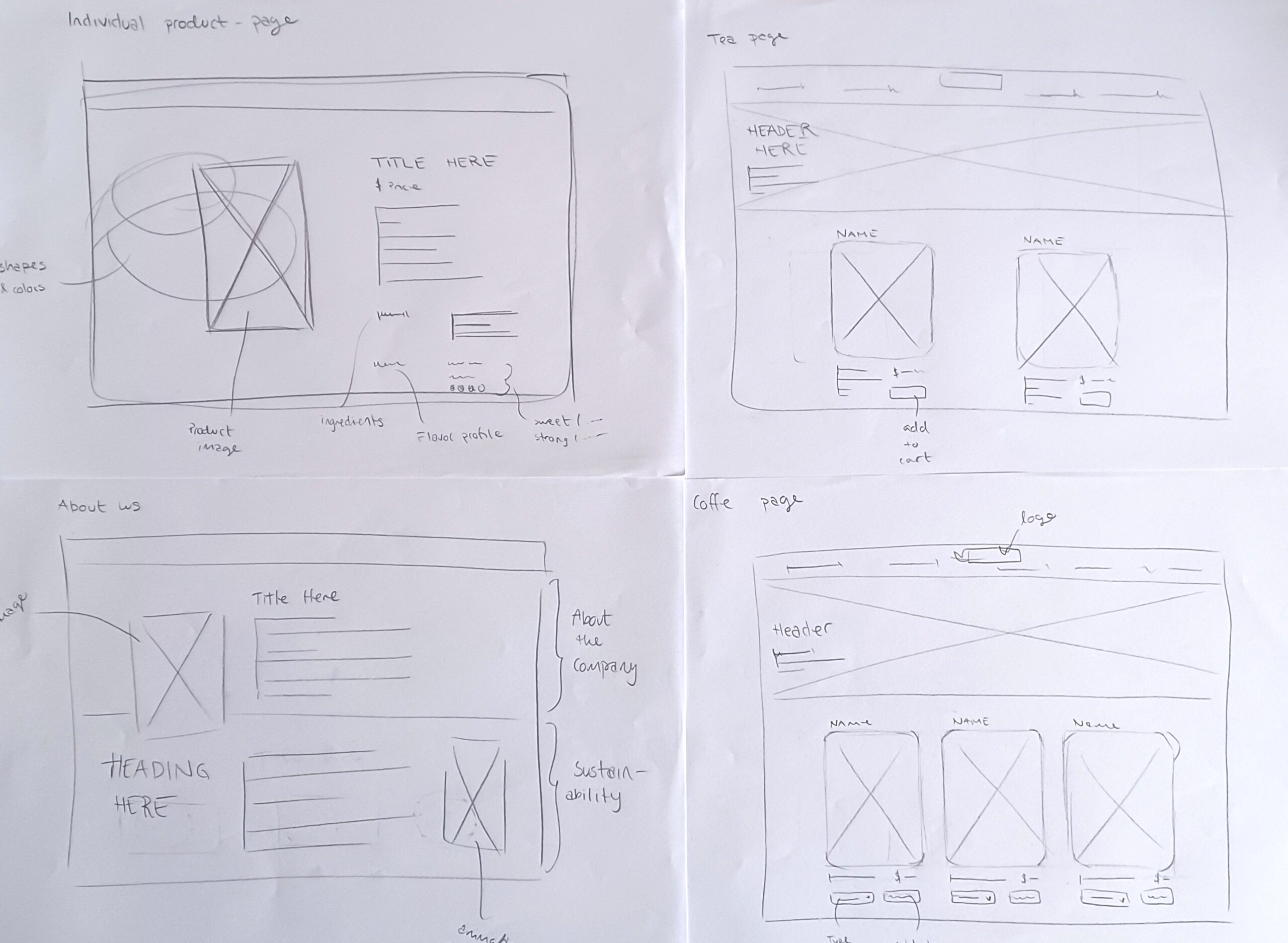
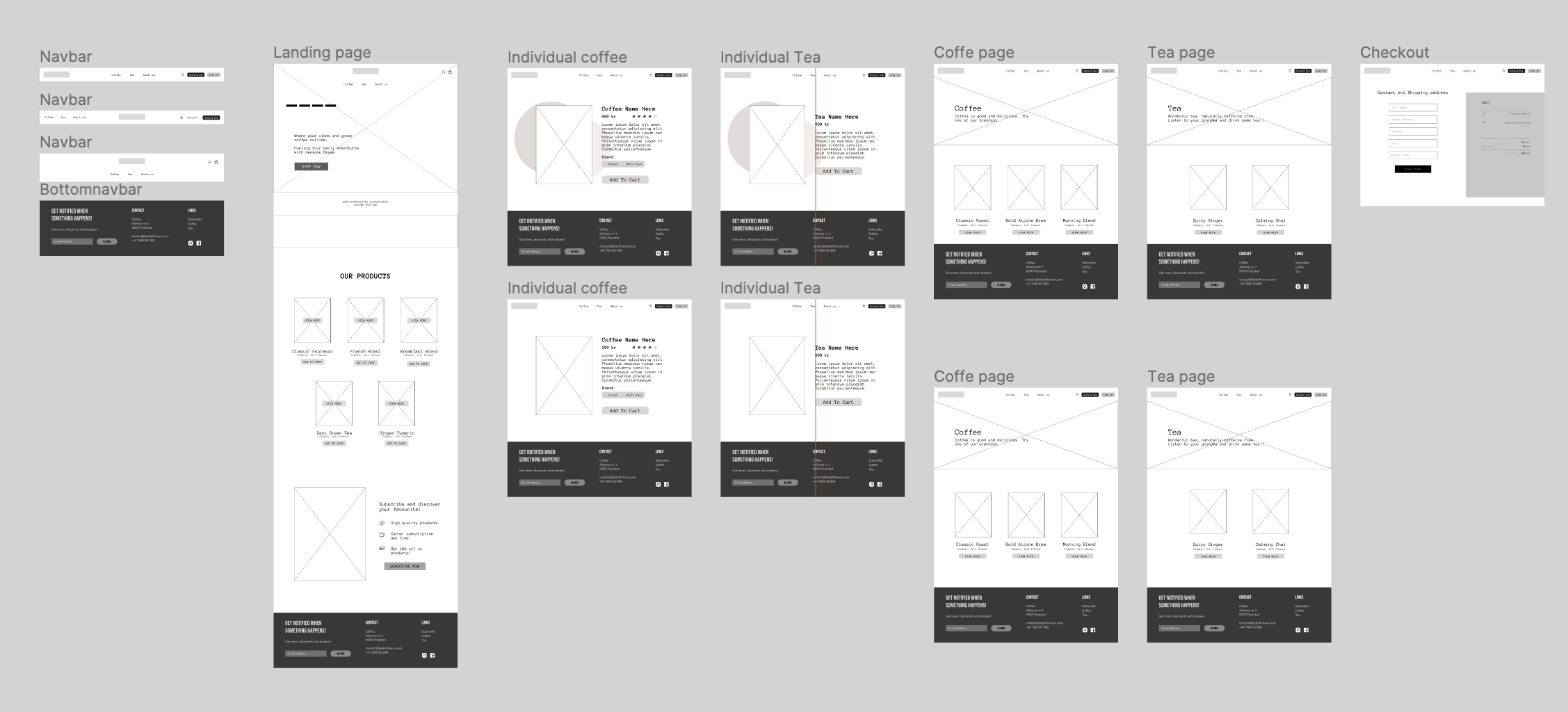
The journey to determine the final design of the website began with simple sketches of the individual pages. I use these sketches to kickstart the idea process and to develop a vision for Sip’s online store.
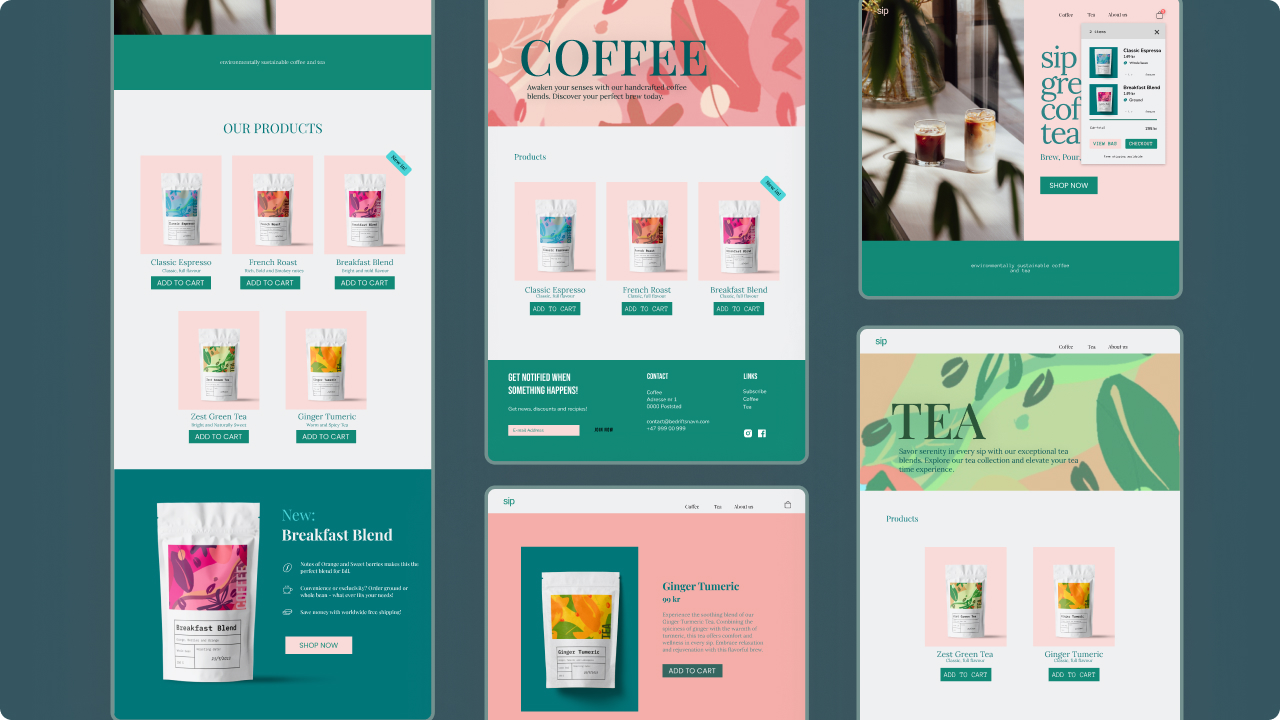
Next, I used Figma to create basic wireframes, which made it easier to get an impression of how the pages would look. I went through several iterations of the wireframes to improve the layout, ensuring it was more user-friendly and logical. For me, it was important that the website was aesthetically pleasing while also allowing the products to remain the main focus.
Content
How to communicate the brands values?

Sip is a company that sells a small selection of coffee and tea products. The purpose of Sip’s website is to create an online store where the range of coffee and tea is presented in an organized and appealing way. At the same time, the site should reflect the company’s values of being sustainable, welcoming, and relaxed. The website is designed to provide a user experience that particularly appeals to young, creative, and quality-conscious customers. The main goal is to drive sales of coffee and tea products, allowing visitors to easily explore and purchase items directly on the website.
Sip’s online store is designed to meet the target audience’s need for information while also creating a sense of community and passion for coffee and tea.
Tone of voice
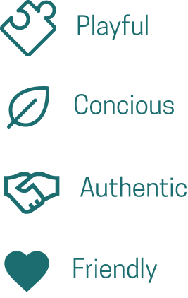
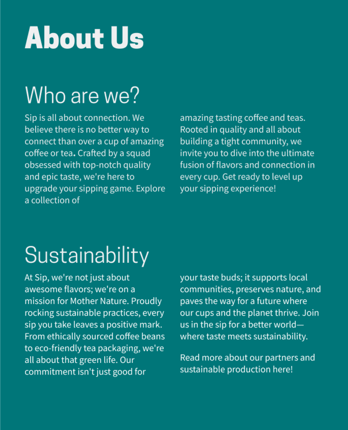
At Sip, a playful and authentic tone is used in the language to best appeal to the target audience. This creates a relaxed and welcoming atmosphere on the website, contributing to building trust and a close connection with the brand and the people behind Sip. The playful style incorporates references that resonate well with our young audience.
Beyond being a linguistic choice, this is also a strategic decision to strengthen the bonds between Sip and our customers. Implementing this tone on the website is an effective way to convey Sip’s values while also creating a positive experience for visitors.
Color palette
Colors that reflect the brand
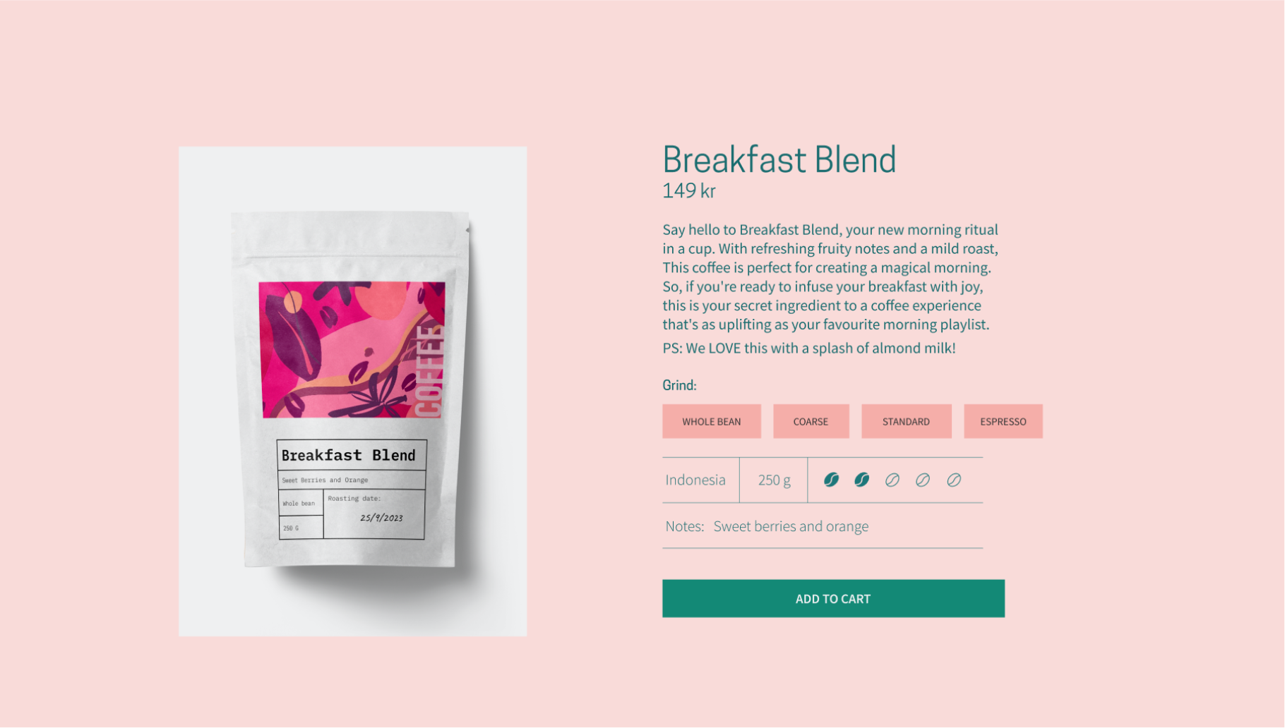
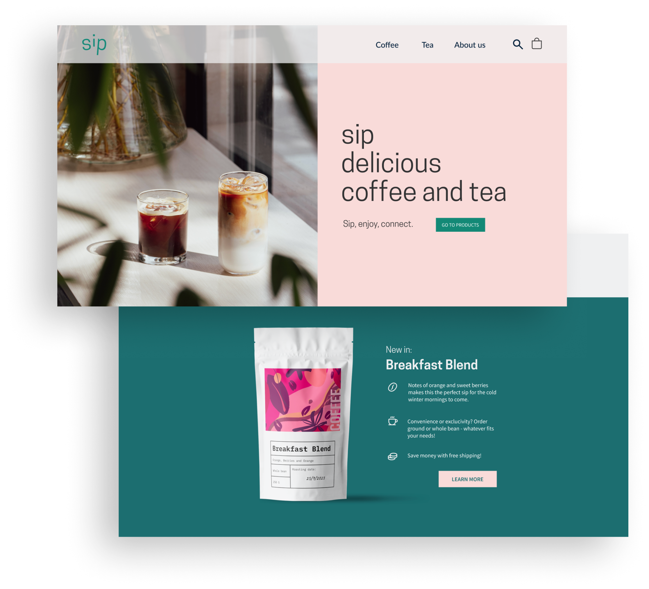
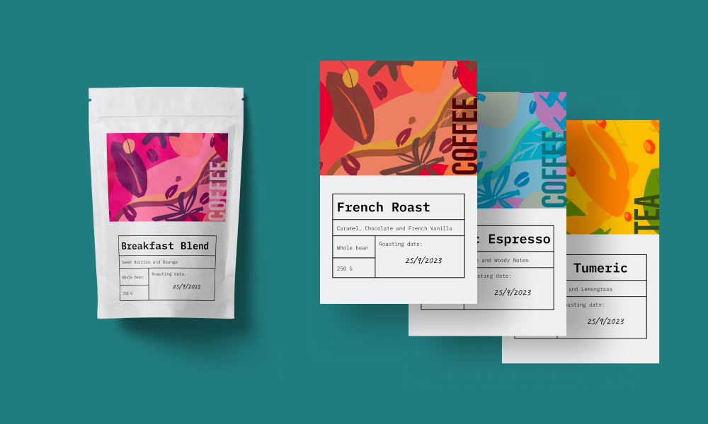
The color palette creates a distinct identity for Sip, where the combination of light pink and dark teal becomes a signature for the brand. At the same time, the palette is relatively limited, allowing the products to shine and remain the focal point.
With warm and welcoming colors, the palette reflects the company’s values. It helps Sip stand out among other coffee and tea providers, while also feeling natural and appealing when visiting the website.

Branding identity
Logo design
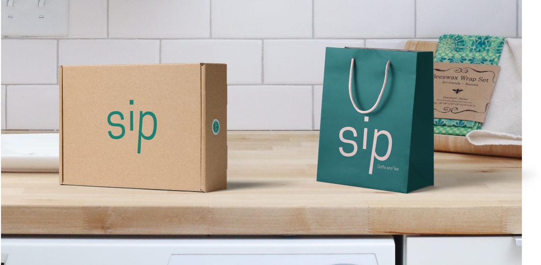
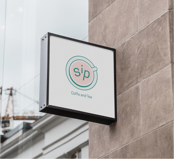
Sip has two versions of its logo: an icon and a wordmark. These two logos provide Sip with the necessary flexibility, ensuring the brand is easily recognizable in different situations and across various platforms. Both the icon and wordmark have versions available for both light and dark backgrounds.
The font used is based on Source Sans Pro. With slight adjustments to the length of the letters, the logo appears playful and modern. In the icon, the wordmark has undergone additional small modifications and has been placed in a cup, making the letters appear as if they are floating in the drink. These adjustments, including the angle of the text in the logo, create a playful expression that gives Sip a unique identity.
Prototyping and delivery
Making a cohesive website
What I have learned
I have truly experienced how important it is to have a structured workflow. Cleaning up in Figma and keeping track of iterations is extremely helpful in the end.
This was my first bigger project working in Figma and creating my own design system. The learning curve has been steep when it comes to visualizing ideas in an effective manner.