Reel Records: A Modern Spin on Vinyl
A record player with minimalistic lines and bold colors.
Duration
3 days
Role
Product designer
Type
School project
Output
Product, logo, poster
Introduction
About the project
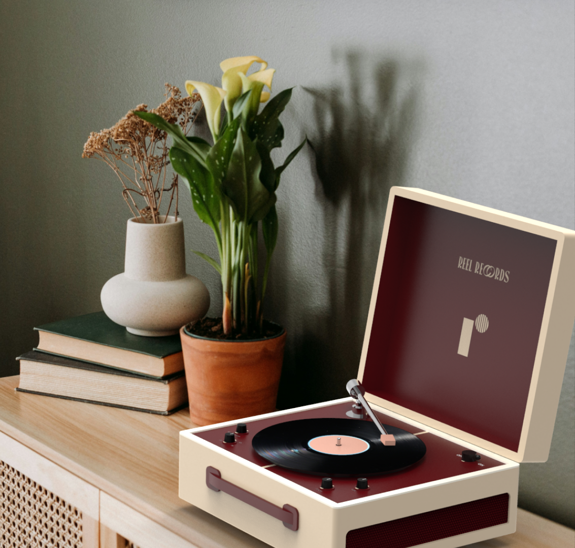
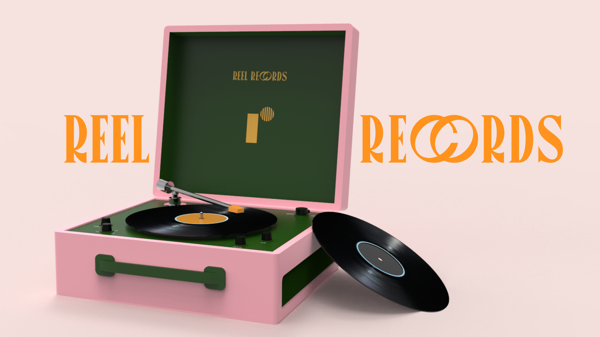
For one of my school exams, I was tasked with designing a record player for a fictional client, Reel Records. The project involved brainstorming ideas, creating detailed sketches, and ultimately producing a 3D model and rendering of the final product. My goal was to develop a modern interpretation of the classic record player, using colors to make it stand out. Throughout the process, I focused on creating a realistic scenario, designing with a potential customer base in mind, and ensuring the final product was both functional and visually appealing.
Mood board
Who will the customer base be?

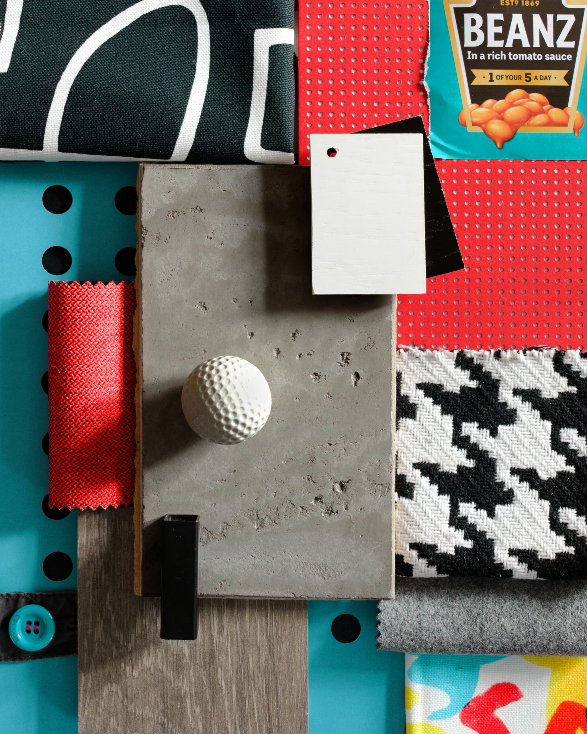
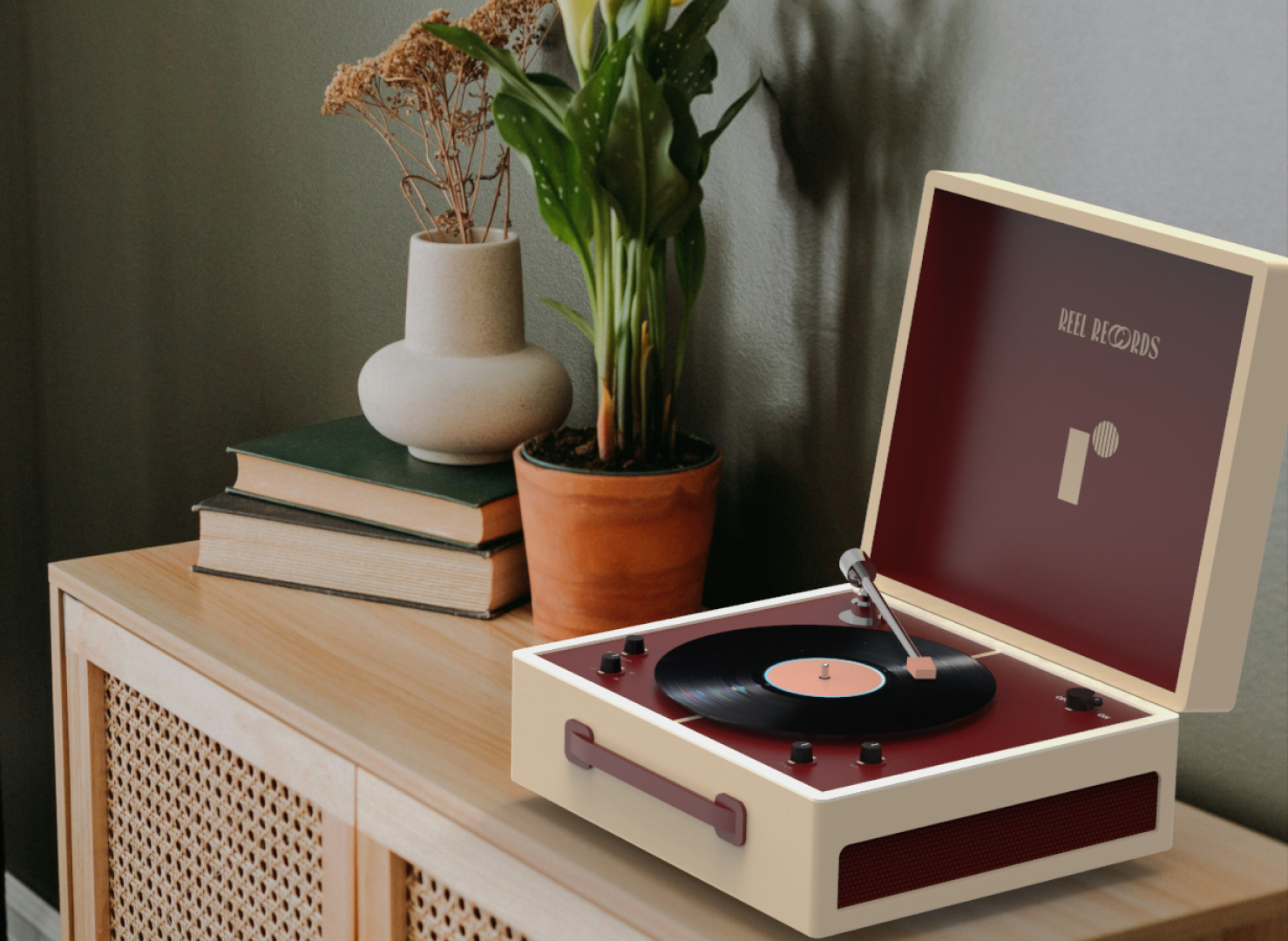
My goal was to design a record player that would seamlessly fit into a cool, funky environment, appealing to customers who truly appreciate the unique value of vinyl. I envisioned the product in a space that’s eccentric and colorful, yet still tasteful, reflecting a balance between bold design and functionality. The aim was to create something that stands out visually while resonating with an audience that values both aesthetics and the listening experience a record player offers.
Building the brand
Creating a logo and color palette
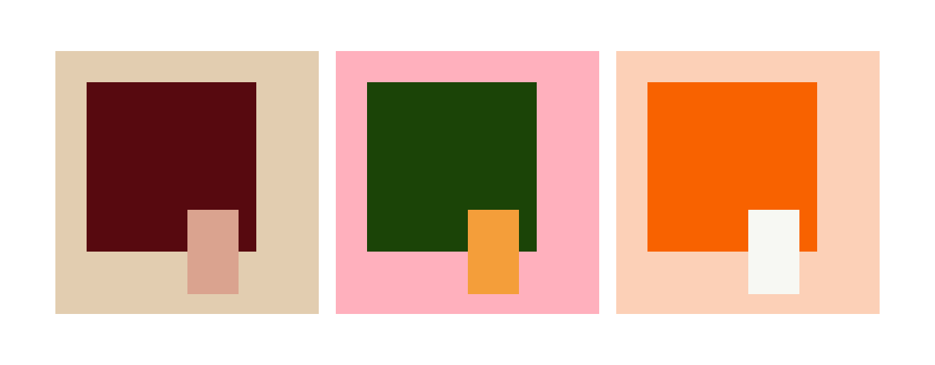
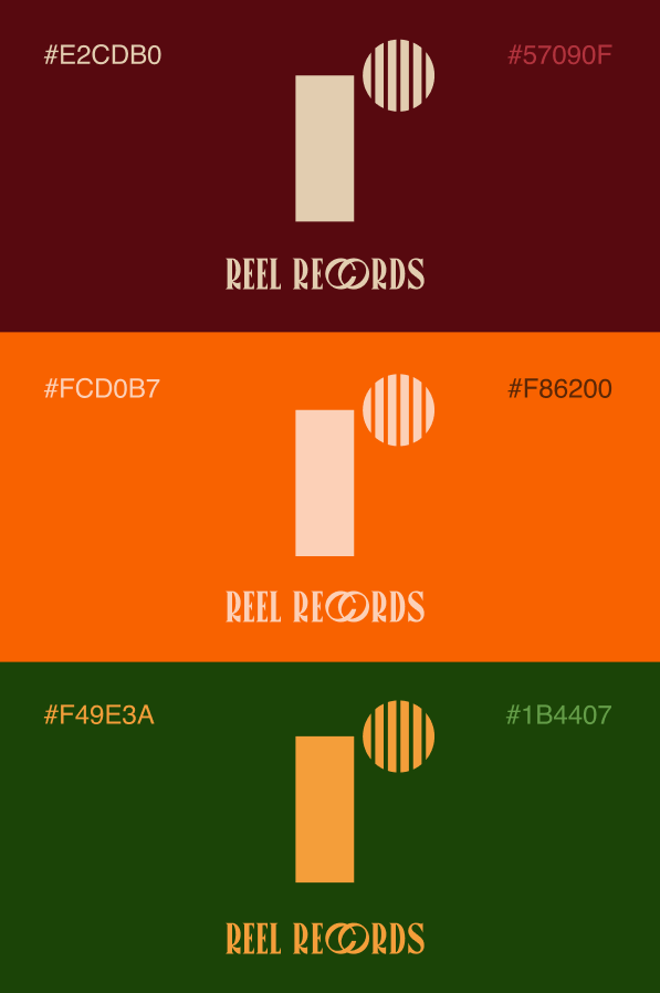
I started with the color palette – having the interior inspiration, my vision was to create a product that could be available in different color schemes. That way, they could appeal to a broader spectre of home styles and colors. Therefore the palette ended up consisting of two bolder and brighter colorways, and one more neutral.
Logo Concept
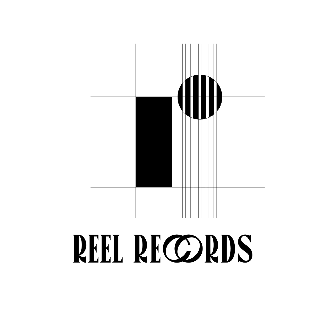
The logo consists of both an icon and a wordmark. The icon features a lowercase ‘r’, highlighting the importance of the letter in «Reel Records.» Additionally, five lines run through the circle of the ‘r’, symbolizing musical staff lines to incorporate a musical element into the design.
The wordmark is based on the Canopee font, with the ‘C’ and ‘O’ slightly overlapping. This font has a retro feel that complements the aesthetic of the record player perfectly.
Designing in Fusion
Sketching and 3D-modelling
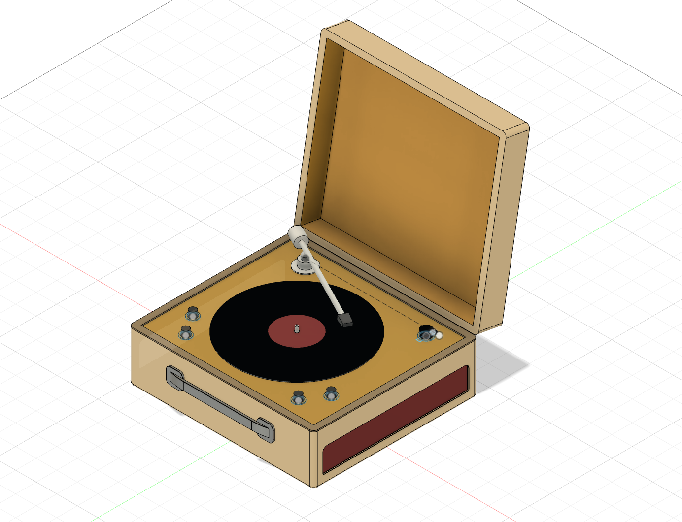
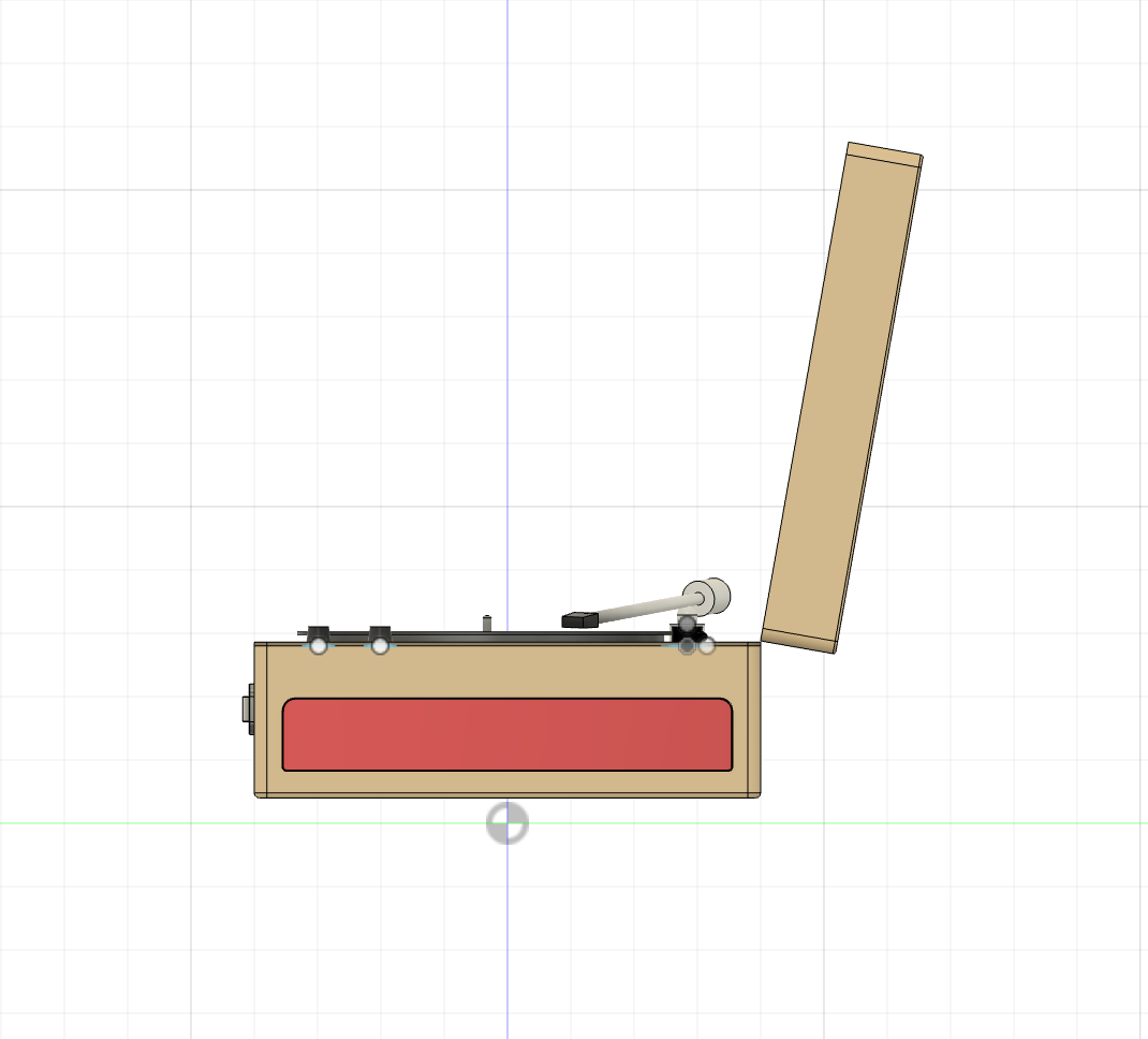
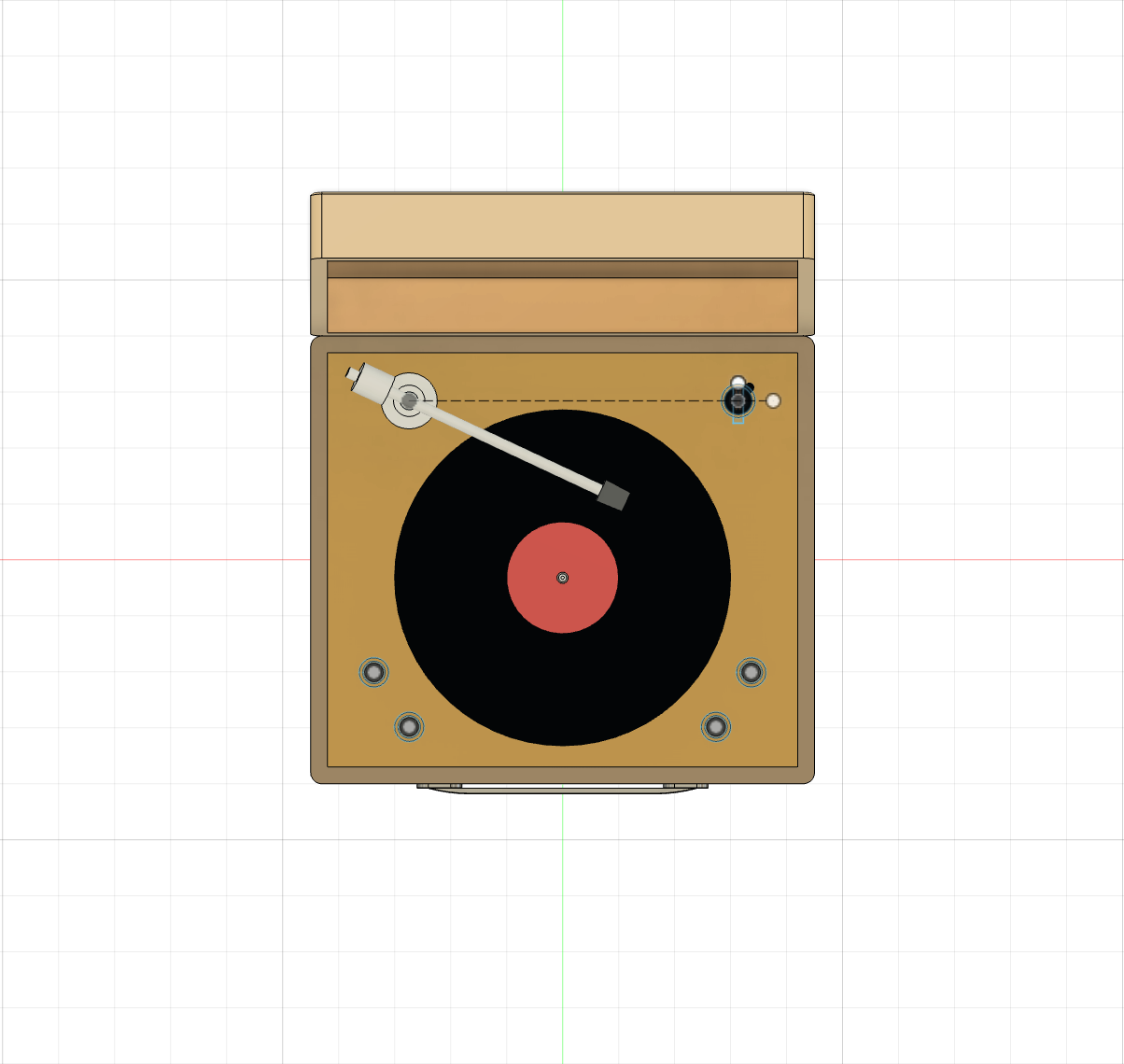
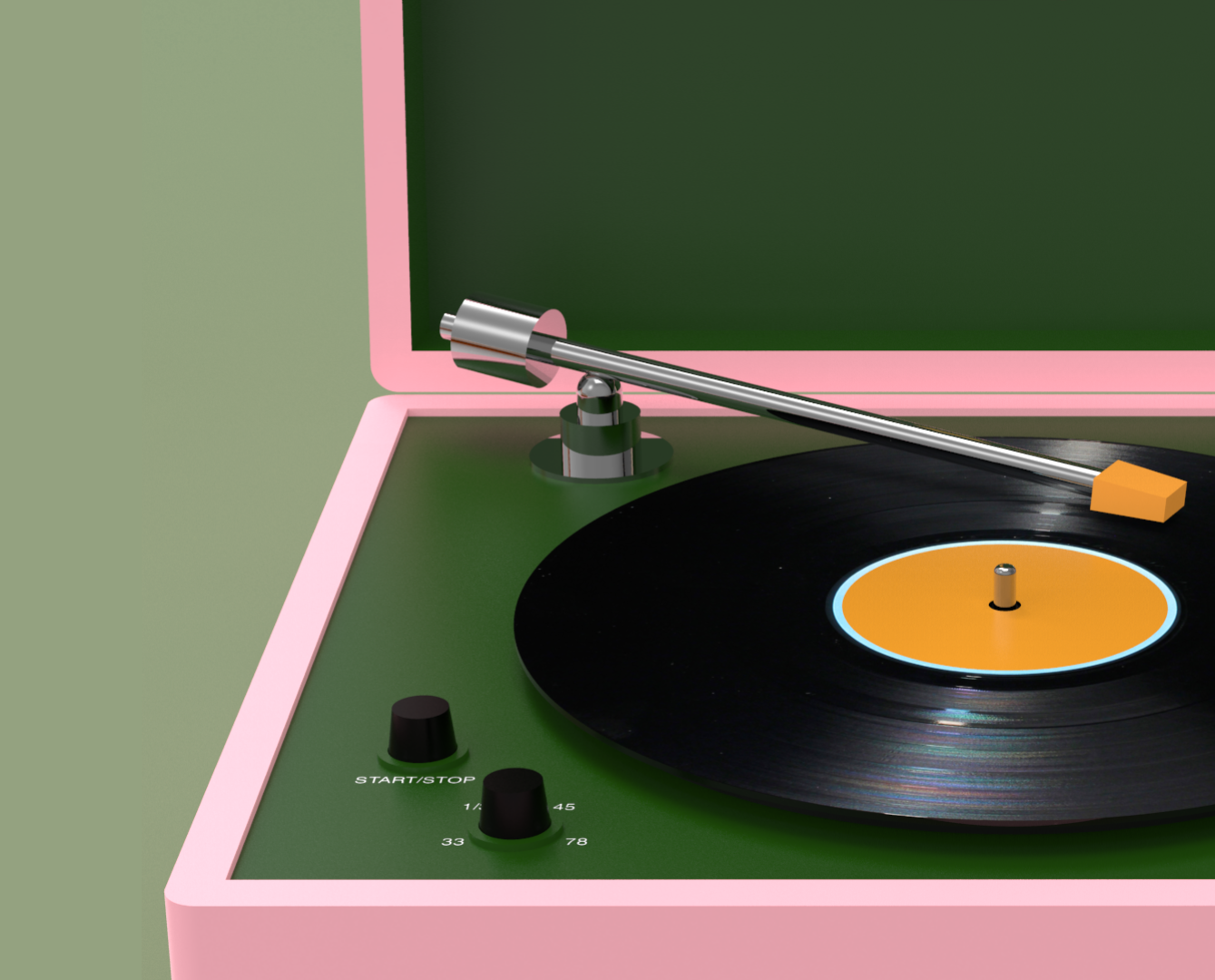
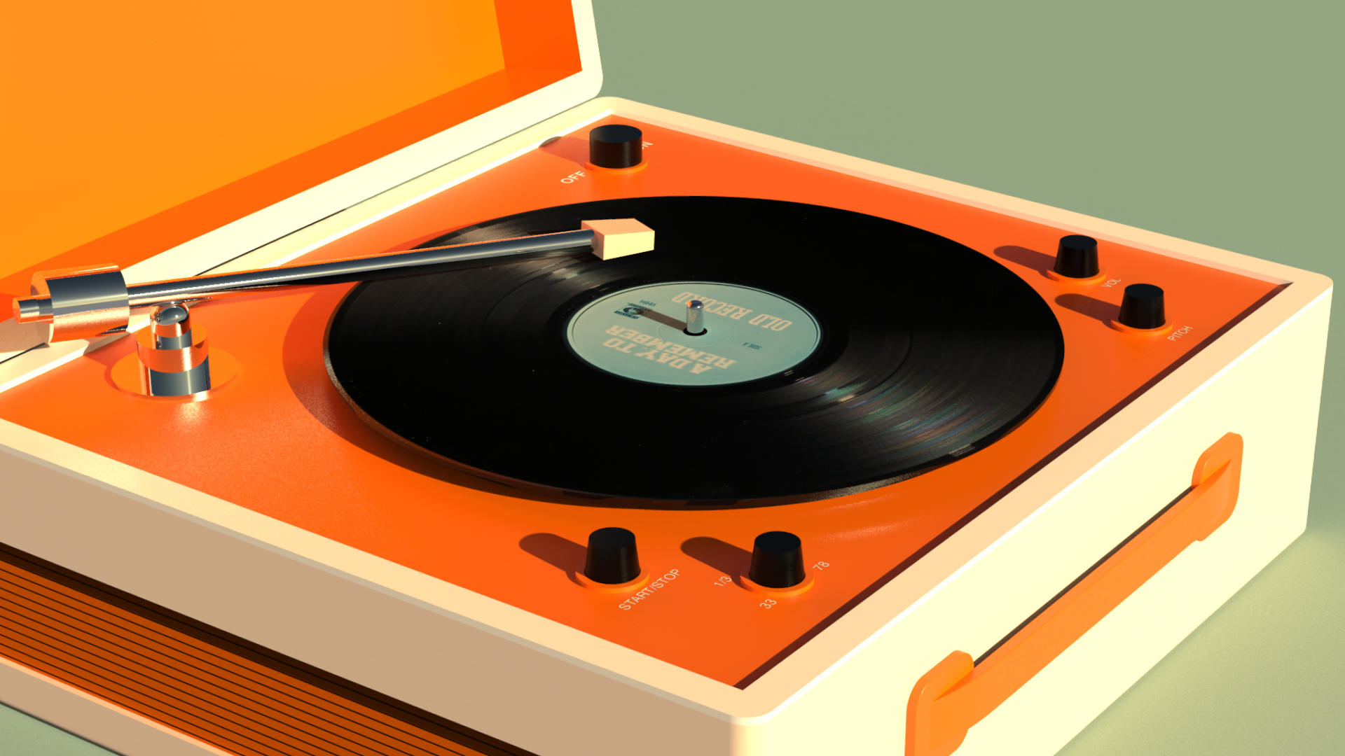
As I worked on the brand identity, I began sketching ideas for the record player’s design. When I moved to Fusion 360, my focus was on keeping the design simple and understated so the colors could really pop. I wanted the clean lines to create a balance, allowing the bold, vibrant colors to stand out without overwhelming the overall look. This way, the record player would feel both modern and retro, fitting seamlessly into a cool, stylish space.
Renders and finished product
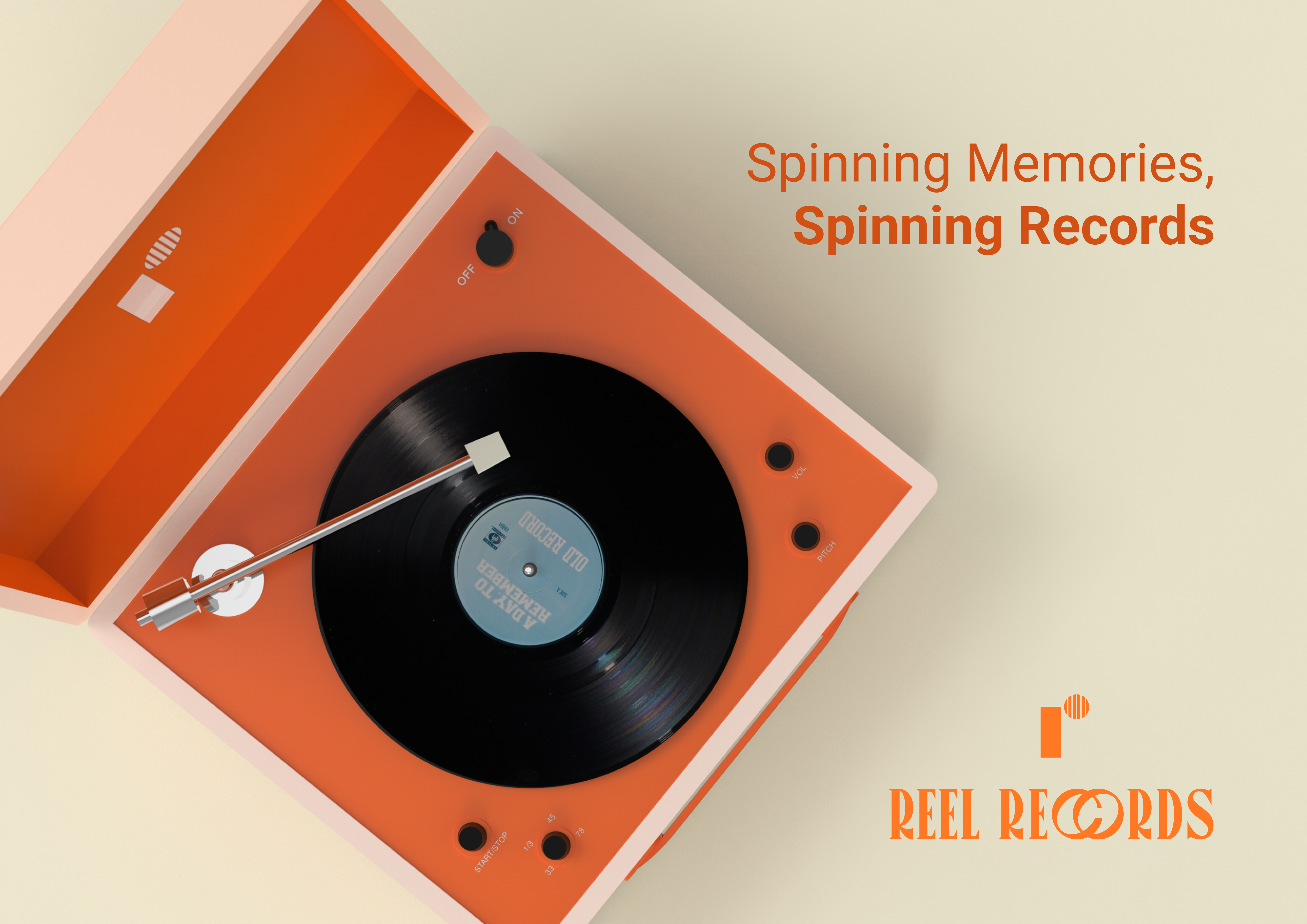
«Spinning memories, spinning records»
Roboto slab is a great choice of font when designing for web and print. It is an easy-to-read font with a clean aesthetic that resonates well with a younger target audience. It is still a serious enough font for the educational tools. Overall, Roboto Slab offers a balance that makes the brand feel both relateable and serious.
What I have learned
The importance of being specific about the user group I am designing for. It makes it a lot easier to map out what the product should consist of when knowing who and where it will be used.
Getting familiar with 3D modelling is maybe the most important lesson from this project. There are so many aspects of creating a good product and render, which I really feel I got a taste for when working with Reel Records.