Enhance your learning with MemoMist
Using smells to help students learn more effectively.
Duration
3 weeks
Role
Graphical designer
Type
Project
Output
Design manual
Introduction
About the project
This project was a collaboration between entrepreneur students and design students. I worked with a startup that focused on creating a product that would enhance students learning. More specifically, how it is easier to memorize something if you smell the same scent when studying for that topic. The task was to create a corporate identity that would appeal to younger adults and students.
Branding requirements
Understanding who the design is for
Building the brand
Creating a logo
Firstly, I wanted to focus on creating a logo that would represent the brand in a way that met my clients expectations and needs. Although this process included lots of tweaking and iterating, these are the main three iterations the logo went through.

Frist draft: The vision was that the wave that went through the «m» would represent the mist in «MemoMist», without being a too litteral interperetation. Ultimately, I concluded that it was too marine – mainly due to the font and the thin stroke.
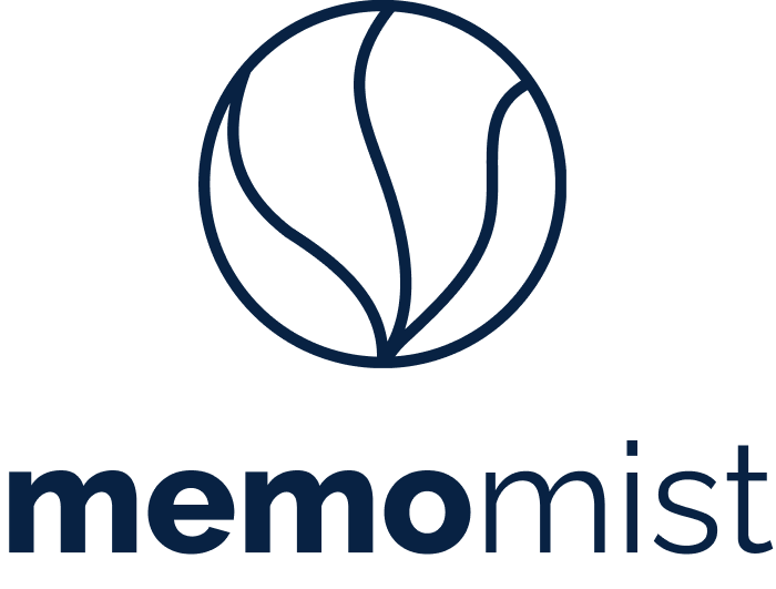
Second draft: A softer approach with a more modern font. This logo had potential for creating many different logo variations. However, it did not feel like as strong as I would like.
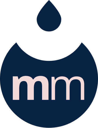
Final logo: The entirety of the logo makes up the shape of a drop, to bring back associations to mist. This final iteration kept the modern font from the second draft, but has a stronger icon.
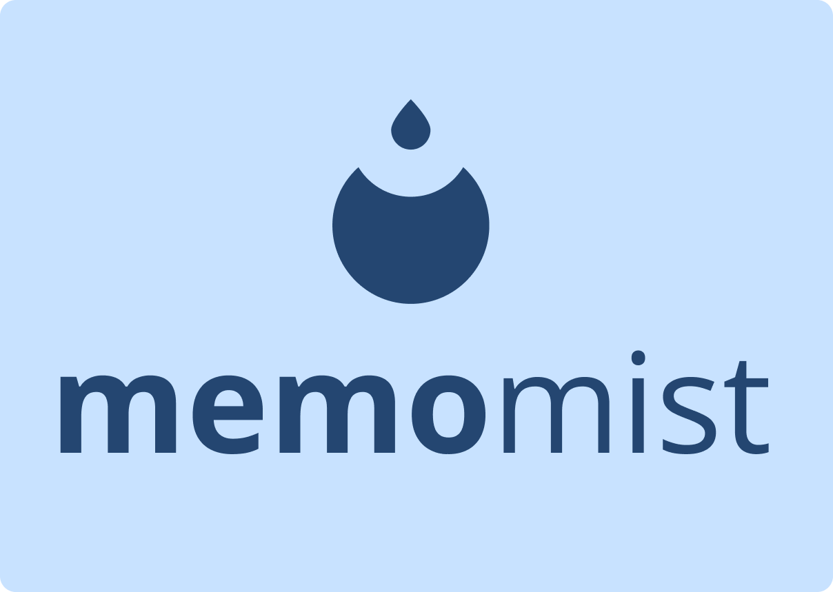
Logo Concept
The MemoMist logo is meant to be representative of the brand, and draws lines from the concept of air diffuser and mist into its design. The entire logo icon makes up the shape of a drop. However, the smaller drop falling into the bigger shape is also meant to represent pieces falling into place. This is a reference to how MemoMist aims to help students remember and study better.
The logo is still a vague enough reference to the air diffuser that it easily can be used for other learning tools later if the company wishes to expand their product base.
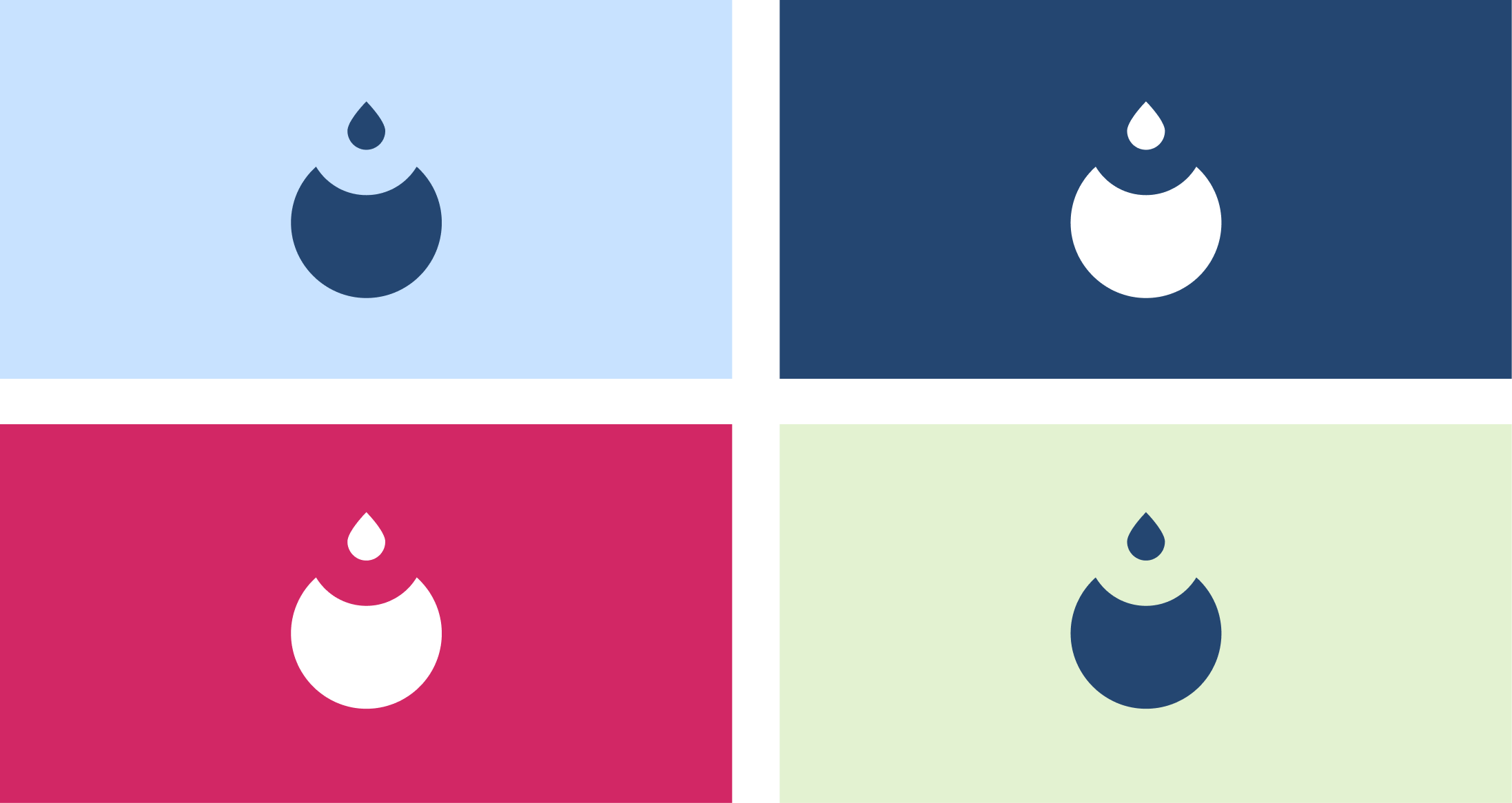
Logo variations
The primary and secondary logo will be used most of the time. The icon will be better to use of smaller surfaces and as an app icon. The icon can be used both with and without the letters.


Choosing a color palette
Soft and harmonious
The color palette should, together with the logo, create a strong and easily recognizable brand identity. I knew I wanted to include soft colors that could reflect the mist and soft feel of the brand. Still, it was important to lean towards being a gender neutral brand. The primary colors of the brand give of a soft feeling. The blue gives associations to learning, while the raspberry red and the sage green can reflect the brands wide range of scents. Te secondary colors are designed to be used sparingly. They can be great accent colors, and especially good to use for different scents.
Primary colors
Secondary colors

Typography
A modern, young and serious font
Roboto slab is a great choice of font when designing for web and print. It is an easy-to-read font with a clean aesthetic that resonates well with a younger target audience. It is still a serious enough font for the educational tools. Overall, Roboto Slab offers a balance that makes the brand feel both relateable and serious.

What I have learned
Working directly with a brand was a great experience. I learned a lot about what questions to ask and how to organize their wishes and needs while maintaining focus on the users.
Iterating many times was crucial for creating this brand identity. Even though I knew iterating multiple times holds great value, I could really see the impact it had on creating a cohesive brand identity.