Simplifying the house hunting journey
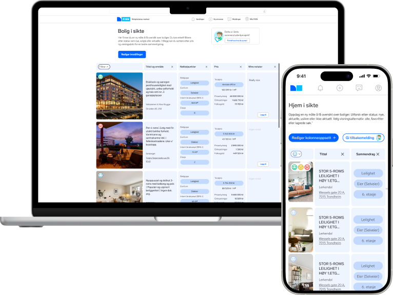
A new table view of real estate on Finn.no. Helping users stay up to date on listings, while easily rating and comparing favourites.
Duration
8 weeks
Role
UX designer
Type
Internship
Media
Web/Mobile
Introduction
About the project
«Bolig i sikte” is the result of my internship at Finn.no in the summer of 2024. The journey began with a simple mission: help homebuyers on Finn.no feel in control when searching for a home. Our team’s task was to create a tool that tackled user concerns about missing out on potential homes. What started as a blank slate soon evolved into a comprehensive comparison tool, with each decision grounded in user research and constant testing.
UX and tech worked closely together on this project, along with the Head of Product, to make sure the design alligned with Finn´s goals. With that said, I started to gather user insight to uncover what Finn users really needed.
Existing knowledge
What is not working on Finn Realestate?
Overview
The design process
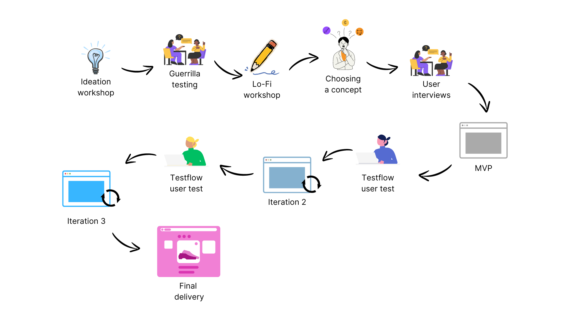
The design process was an iterative journey of discovery, research, testing, and brainstorming. Here’s how we moved from initial ideas to the final product:
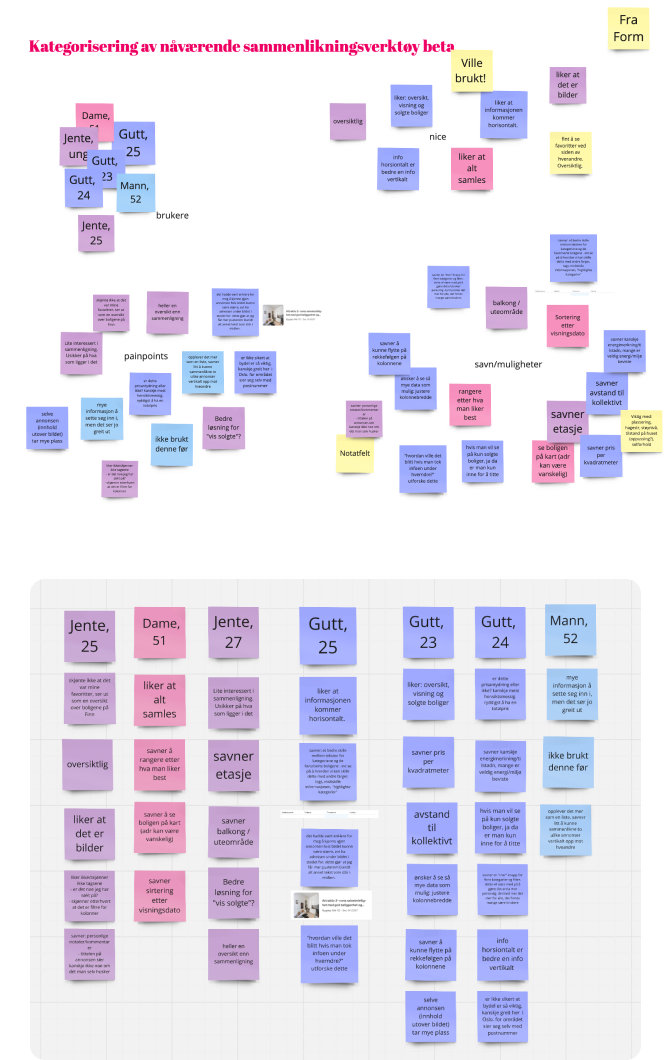
We began by leveraging our existing knowledge and then looked further into understanding the needs and pain points of our users. To ensure alignment across the team, we organized collaborative workshops. These sessions became critical in refining our shared vision. My role, alongside my co-designer, was to facilitate creative thinking and help the group articulate their insights and ideas.
Once we had a clear understanding, we moved into rapid concept testing, where we explored various approaches to see what resonated most with users. This allowed us to quickly identify key opportunities and prioritize features that would provide the most value.
We quickly built an MVP, focusing on core features to test with real users. Through rounds of testing and close collaboration with the tech team, we refined the product, addressing usability issues and ensuring alignment with technical requirements. This process allowed us to launch the final version as a fully live product.
Ideation Workshop
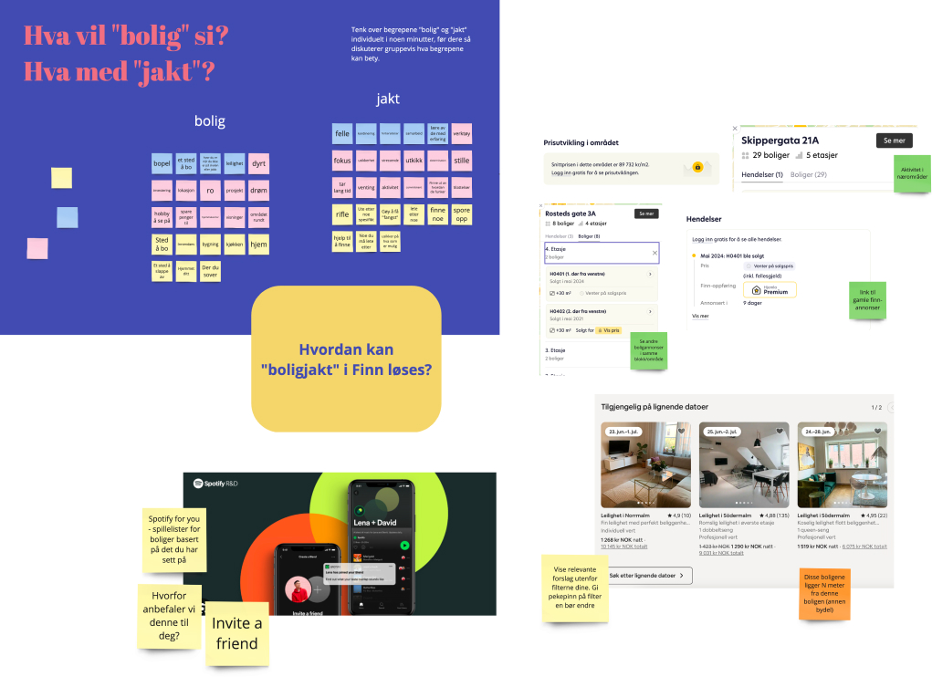
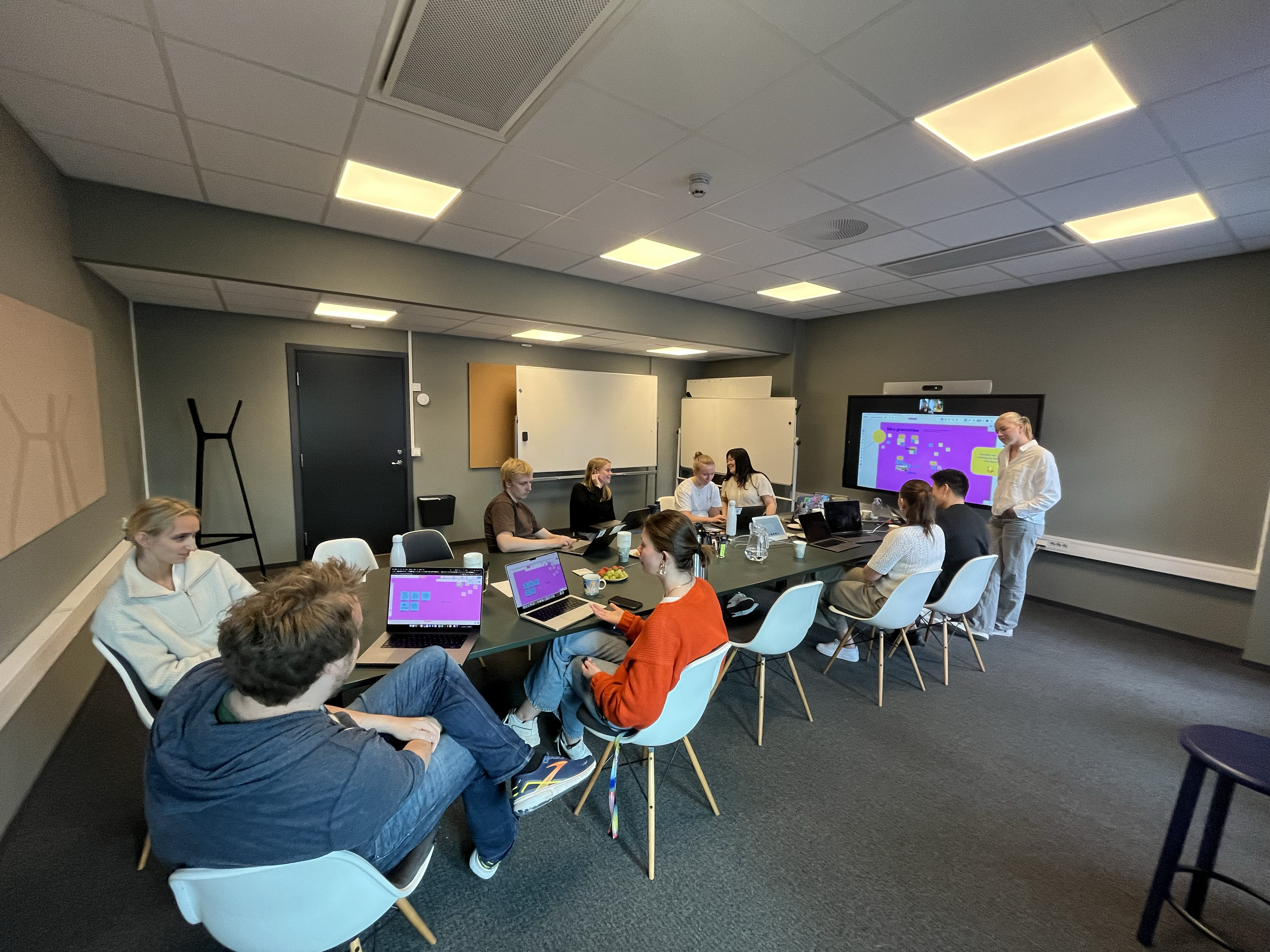
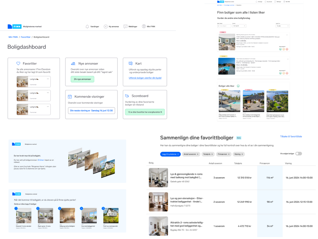
To kickstart the creative process, we organized an ideation workshop with our team. The focus was on breaking away from conventional thinking, using targeted exercises to spark new ideas and encourage out-of-the-box solutions. Through collaborative brainstorming, we unlocked new perspectives that pushed the boundaries of what we thought possible. This workshop was a great way to uncover unique concepts that would drive our project forward.
Guerrilla Testing & Survey
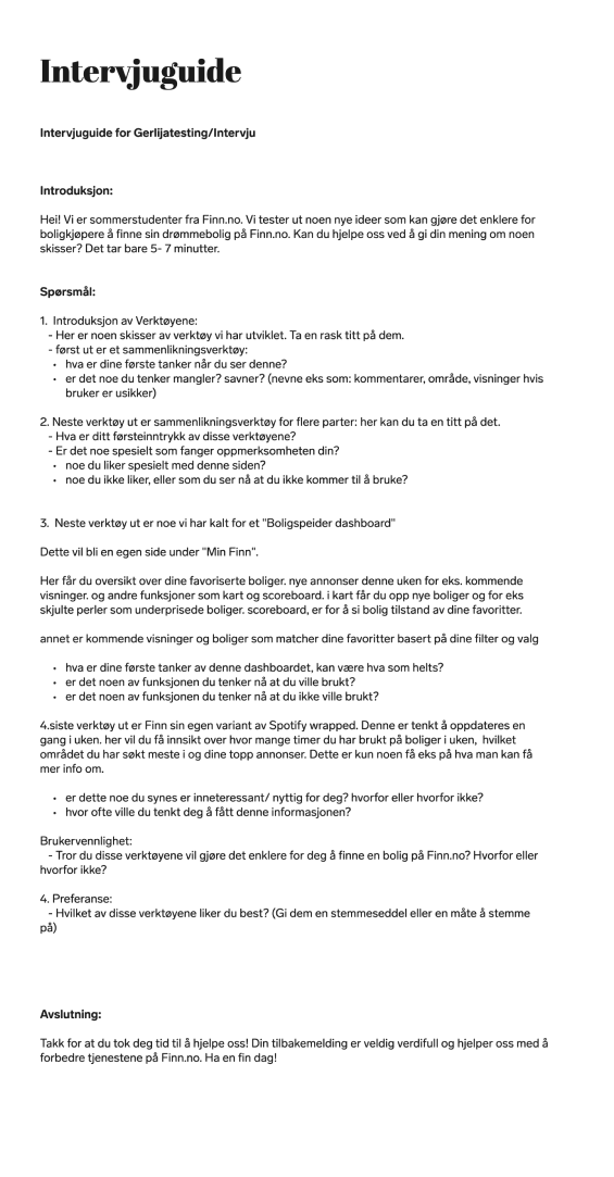
After workshopping with our team and consulting with Finn real estate workers, we developed four key concepts. To quickly gather feedback, we conducted street interviews in Oslo as well as a survey to broaden our search. This rapid approach provided immediate feedback on what resonated with users. We tested a comparison tool, a collaborative list, a housing dashboard, and a feature inspired by Spotify Wrapped.
The insights were clear:
- Users valued comparing homes easily.
- Most were unaware of an existing comparison tool.
- A collaborative solution for house hunting was a relief for many.
- Users wanted to feel up-to-date on the market and upcoming viewings.
Product developement
Embracing the comparison tool
Following our research, we decided to zero in on the housing comparison tool. Among the four concepts we tested, this tool and the collaborative list stood out. However, it became clear that users needed a tool that provided control and clarity over their home search more than early-stage collaboration.
A prior Finn hackathon had already laid the groundwork for a comparison tool with a table view. Our task was to elevate this initial concept, refining it to better align with user needs. We started by sketching and iterating on the design, using insights from our guerrilla testing. With a refined concept in hand, we moved on to user interviews for deeper insights, ensuring our tool would truly resonate with users.
What did we learn from testing?
From our user feedback, several key insights emerged:
- Simplicity and Clarity: Users wanted info-modules that were both easy to understand and compare. These modules needed to be informative yet digestible, offering more than just raw data.
- Intuitive Navigation: The design needed clearer navigation to help users easily sort by personal ratings, add or remove columns, and change data sources without confusion.
- Enhanced Accessibility: We recognized the need to make the tool more accessible on Finn’s platform, ensuring users could easily integrate it into their existing workflows.
- Prioritizing the Comparison Tool: While onboarding and offboarding processes were important, they became secondary to refining the comparison tool itself, which was central to addressing user needs effectively.
User interviews
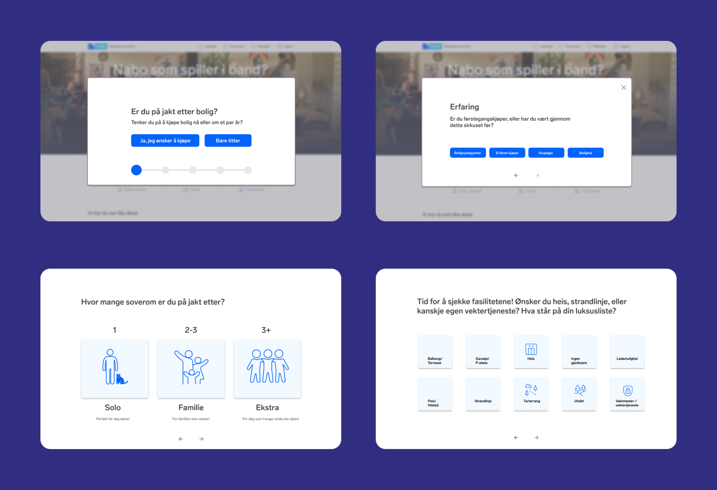
We wanted to simplify the search criteria while also making it more visual. Therefore the early stages of our concept included a «onboarding» were you could essentially create a search.
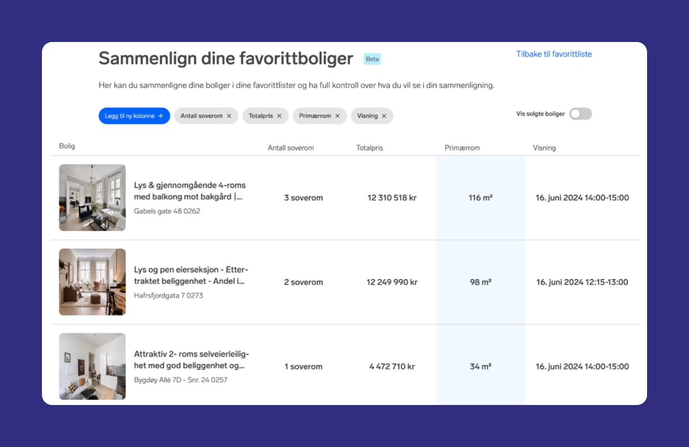
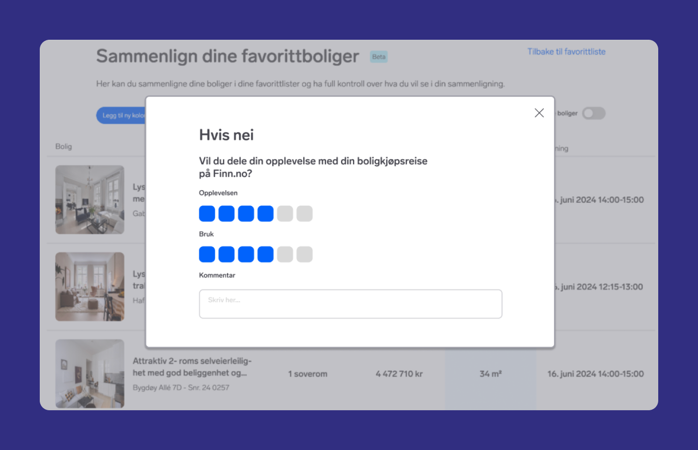
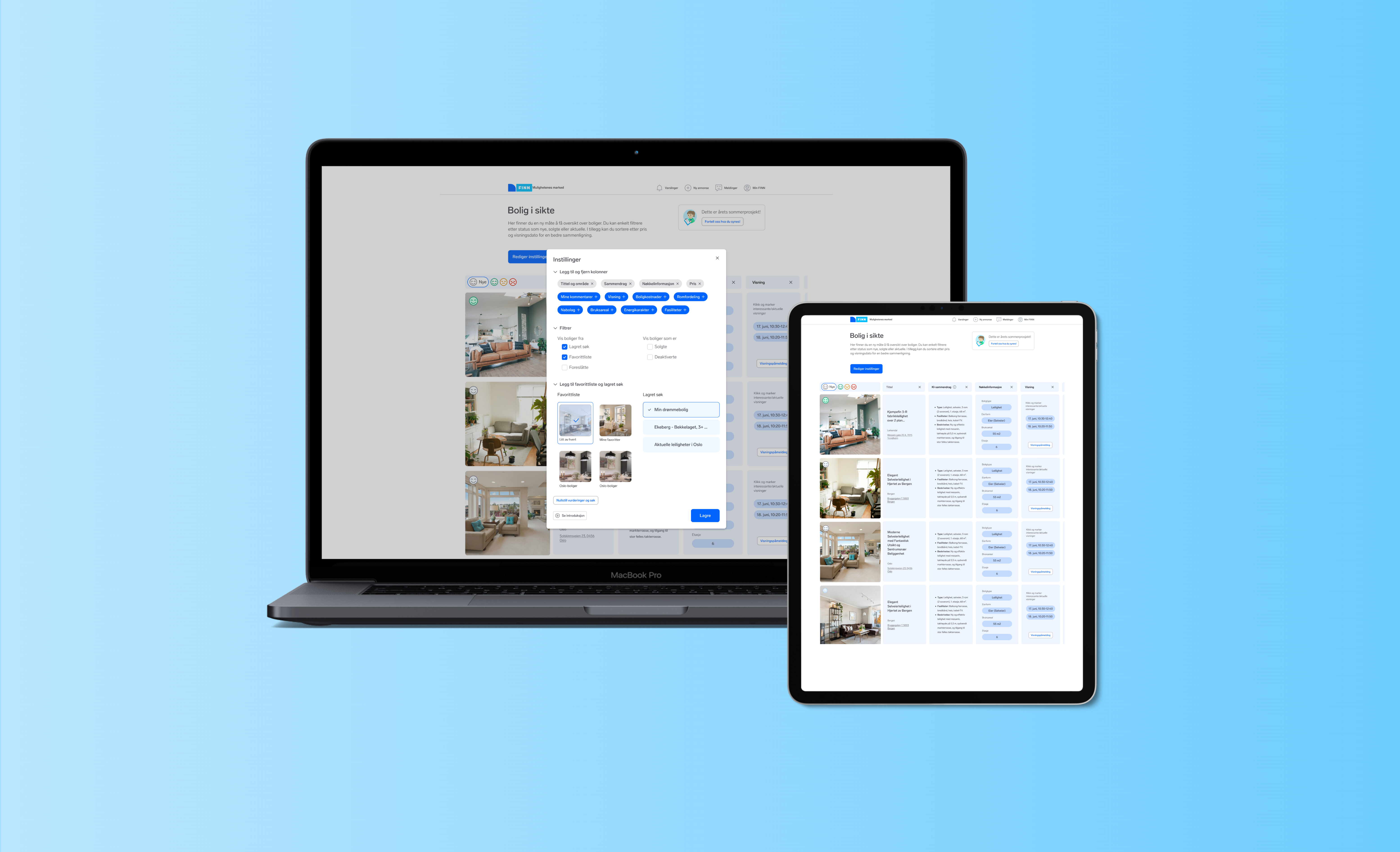
This is the main comparison tool. It consists of a table view with the houses and datapoints as rows. You can add and remove columns like price, area and viewing dates.
At this point we thought of the house hunting journey as linear, with a start (the onboarding) and an end. This is what we reffered to as the «off-boarding» – a way for the user to officially end their jouney.
Iterating
Refining the design
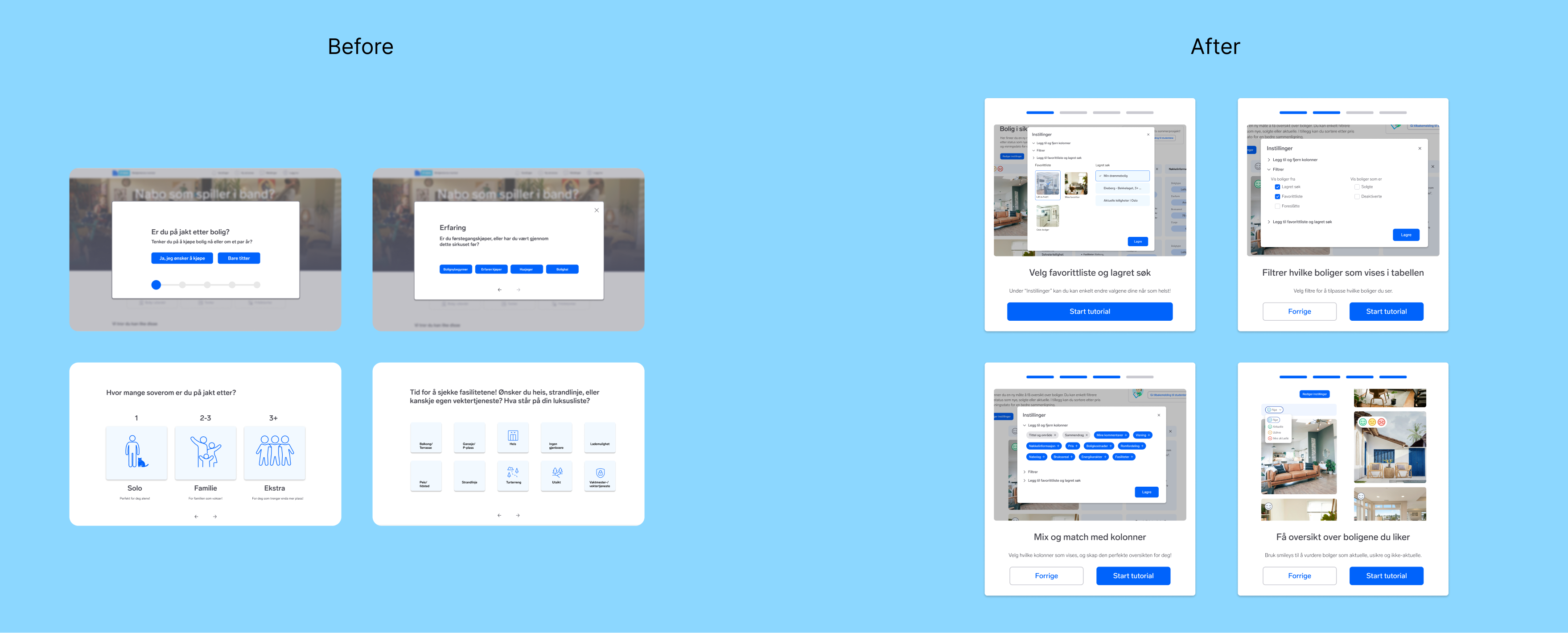
Following the initial round of in-depth user interviews, the direction for the project became much clearer. With my co-designer, we focused on fine-tuning the info-modules and improving overall page navigation. We decided to shift from our previous onboarding and offboarding designs to a more informative onboarding process, aimed at helping users effectively use the tool.
To further refine our design, we conducted two additional rounds of user testing using Testflow. Although Testflows are unmonitored and allow for more candid user reactions and answers, they also present challenges in interpreting feedback without the ability to ask follow-up questions. The primary objectives of these tests were to enhance the visual elements of the page, optimize navigation, and improve the overall user flow.

Future work
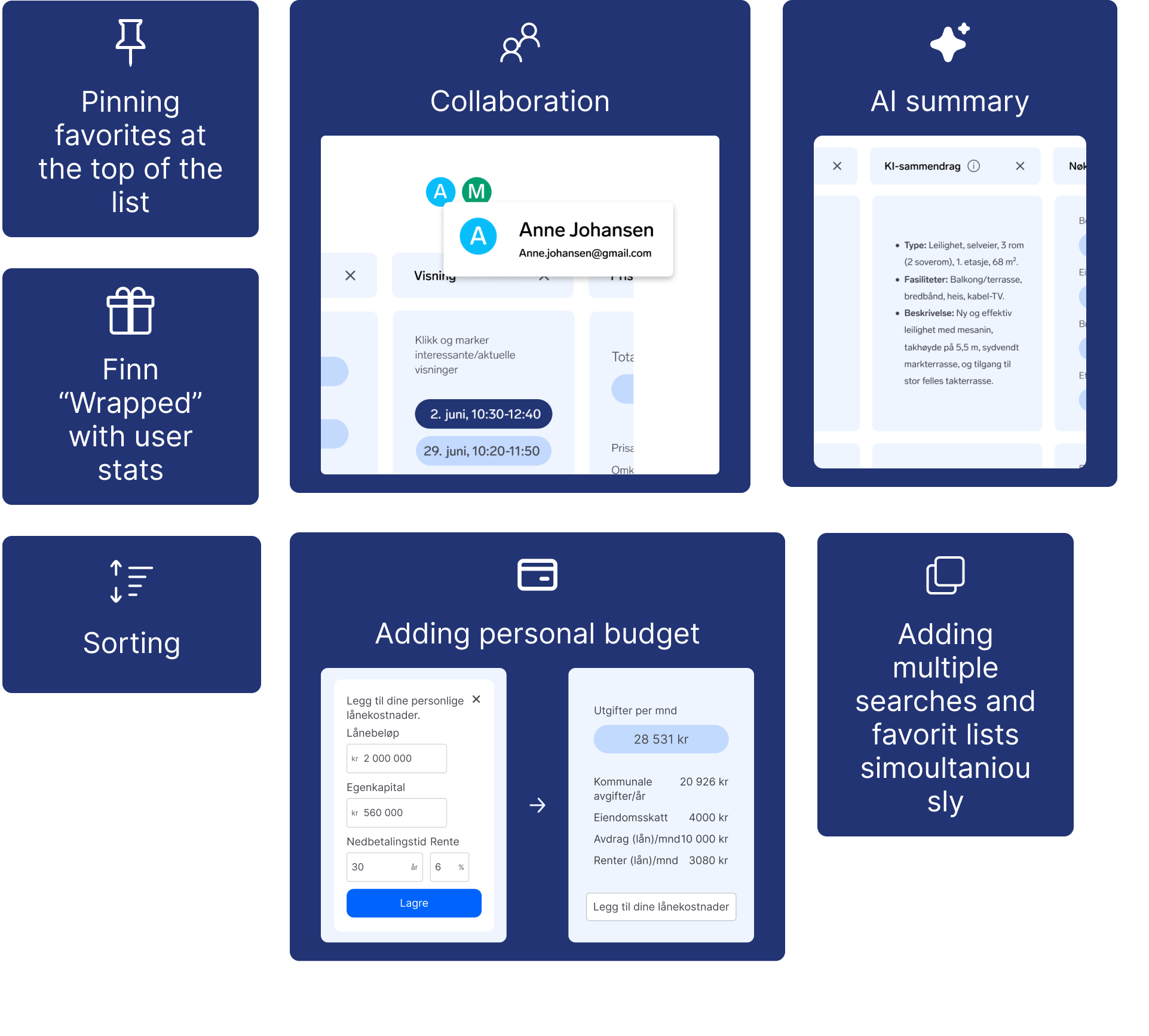
If i had more time, these are things I would include
Project delivery
Final deliverables
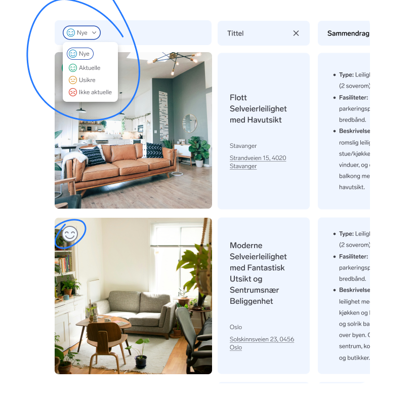
Allowing users to give a rating to potential homes and sorting the list based on those ratings.
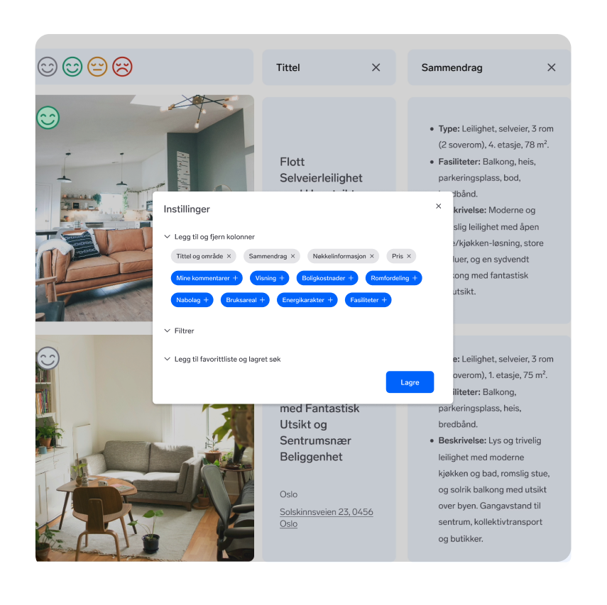
Helping users customize their table view to gain a sense of overview based on the parameters they find important.
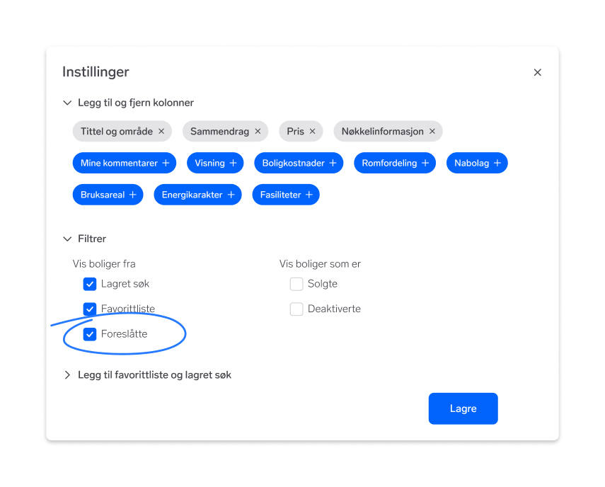
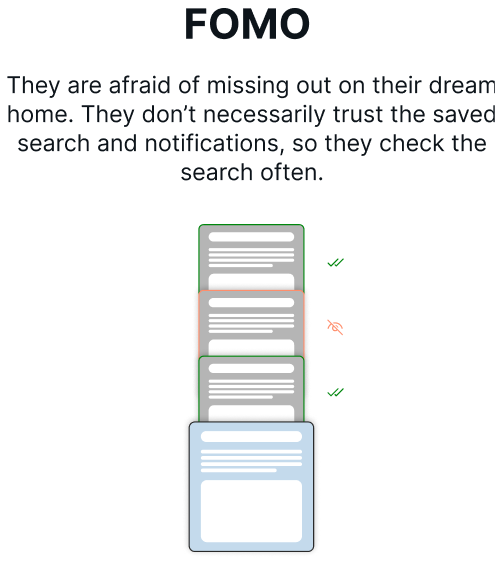
Addressing the issue of FOMO by viewing suggested properties. This will show homes that match most of the search criteria.
What I have learned
Working with developers was completely new to me when I started the internship. Even though I have experience with programming, there was a still tings to learn about how to communicate and collaborate in an effective way.
During this internship I have gained experience in creating and facilitating workshops. I found that this is not only something I really enjoy, but also feel like I am good at.
Prior to this project, I had limited experience with working closely with users and user testing. I have learned many methods for doing user research and testing that I feel have made me a much better designer.